
Block layouts
The Components Editor enables you to create and edit page layouts yourself by adding and repositioning components, such as layout blocks.
Alternatively, you can use one of our ready-made page layouts to get started.
In this article:
Add a block layout
The Components Editor provides standard block layouts - preset arrangements of content blocks - in the left-hand menu. You can use these to quickly position your text, images and other content.
-
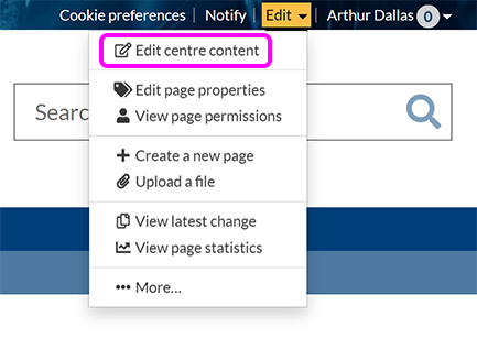
Browse to the page where you want to add a block layout.
-
Go to Edit > Edit centre content:
-
Place your cursor where you want to add the layout block.
-
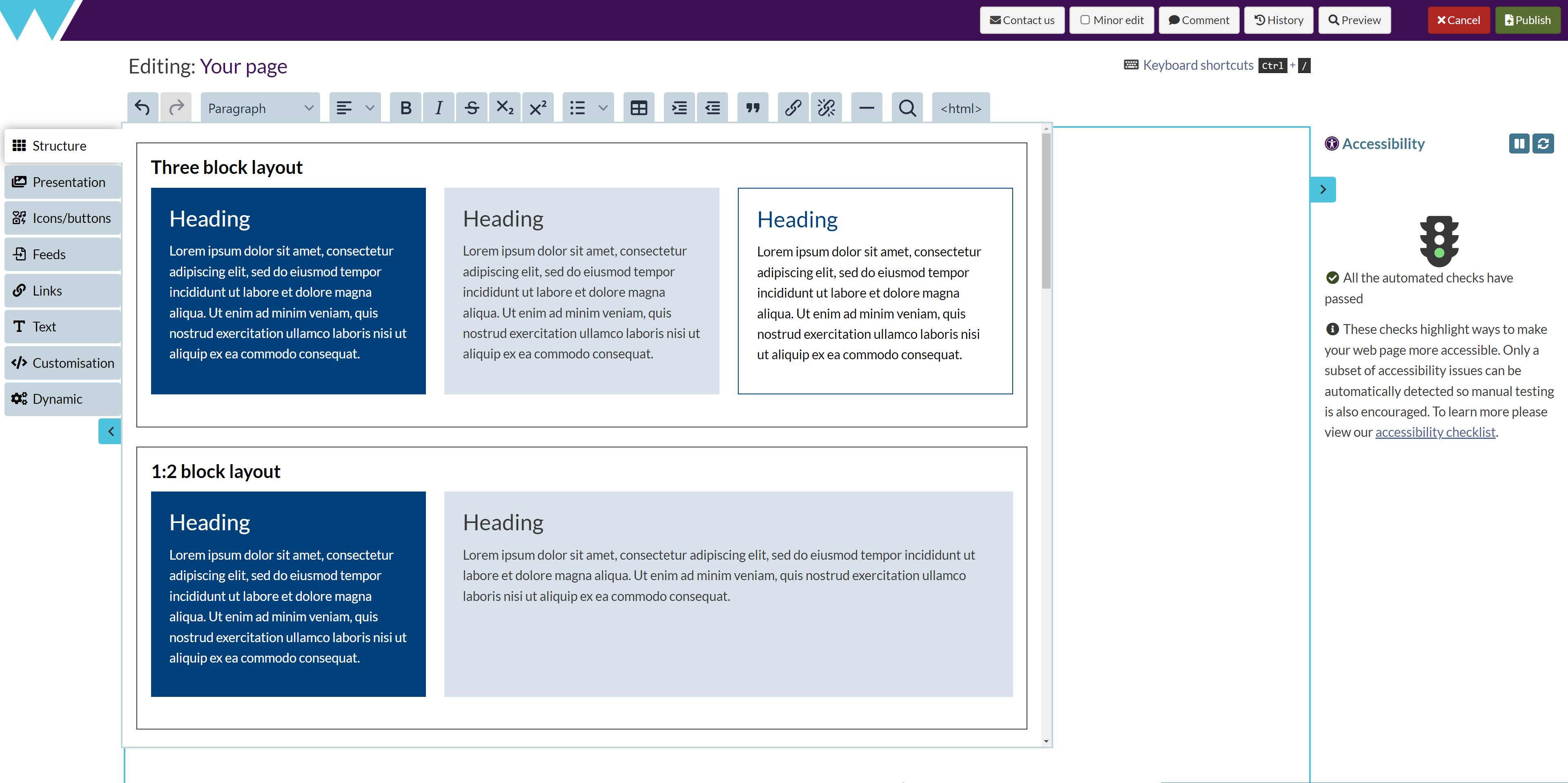
Select Structure in the left-hand menu, then choose one of the available options:

-
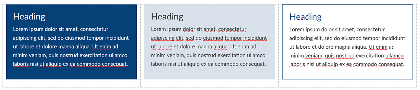
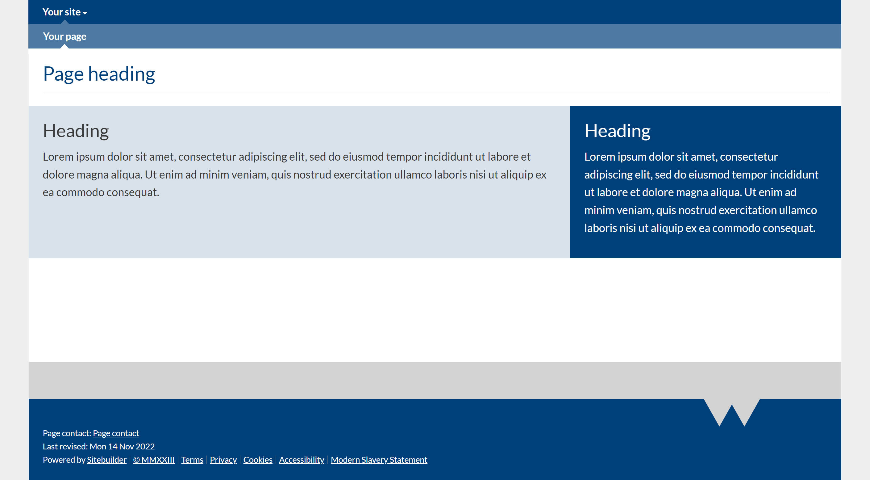
Three block layout: Three equal-sized blocks arranged in columns.
-
1:2 block layout: Two blocks arranged in columns, with the first occupying a third of the available space, and the second occupying two-thirds.
-
2:1 block layout: Two blocks arranged in columns, with the first occupying two-thirds of the available space, and the second occupying one third.
-
Two block layout: Two equal-sized blocks arranged in columns.
-
Three blocks with images: Three equal-sized blocks with images at the top and text below, arranged in columns.
-
2:1 block layout with image: Two blocks arranged in columns. The first occupies two-thirds of the available space, with an image on the left-hand side and text on the right. The second occupies the remaining third of the available space.
-
1:2 block layout with image: Two blocks arranged in columns. The first occupies a third of the available space. The second occupies the remaining third of the available space, with an image on the left-hand side and text on the right.
-
Custom block layout: Two empty, unstyled blocks that you can add to, resize and reorder, or add styles.
-
-
The layout blocks component you selected appears on your page, containing placeholder content.
-
Replace the placeholder text with your own content.
-
Replace any placeholder images with your own:
-
Select the placeholder image, then in the toolbar that appears above it, select Settings:
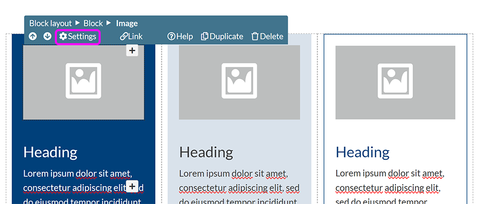
-
Use the Image pop-up to specify your image settings.
-
-
You can additionally customise your layout by changing the number, width, and order of columns in a block layout, the spacing of columns in a block layout, or the style of content blocks in the layout.
-
When you've finished editing your page, select Publish.
Change the style of a content block
You can select from a number of preset styles to change the appearance of the content blocks on your page.
-
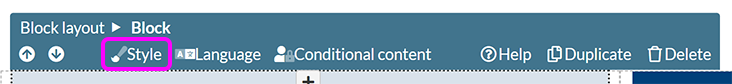
Place your cursor inside the block.
-
In the component toolbar, select Style:
-
Select the style you want from the available options in the pop-up:

Note: The colours of block styles available by default are based on the site style.
-
Selecting the Flush to edges of container checkbox removes any margins from the sides of the selected block, allowing it to fill the full available width.
-
The Flush to content above checkbox removes any margin from the top edge, so text or images within the block will appear closer to the content directly above it.
-
Deselecting Include margin below box removes the standard space below the block.
Tip: If your site or page uses custom CSS styling, you can use the Custom block class field to tell SiteBuilder to use a custom class for the selected block, like this one. To apply multiple classes, enter the class names separated by a space.
-
-
Select Submit to apply your selected style.
Change the number, width, and order of columns in a block layout
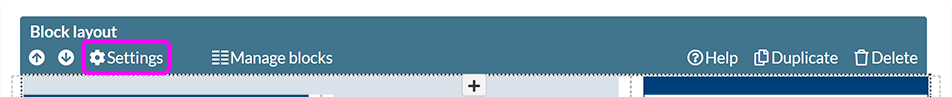
To change the number or size of columns, select Manage blocks in the component toolbar.

In the Manage blocks pop-up:
-
Use thedrag icons to re-order your blocks.
-
Set blocks' relative widths via the drop-down lists.
-
Duplicate an existing block, including its style and content.
-
Delete unwanted blocks.
-
Select Add new block to insert an empty, un-styled content block.
Tip: Each block's width is set as a number of twelfths of the available space. This enables you to divide the space into two, three, or four equal columns. Ensure that the total value for all your columns adds up to 12 to prevent display issues.
Change the spacing of columns in a block layout
If you want your content to display without the standard gaps between blocks, select Settings in the component toolbar:
To remove the space between individual blocks within the block layout, select the Hide gutters between blocks checkbox. To remove space from the side of the sides of the block layout, making it take up the full width of the page, select Flush the edges of the layout row to the edges of the page:
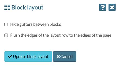
Select Update block layout.
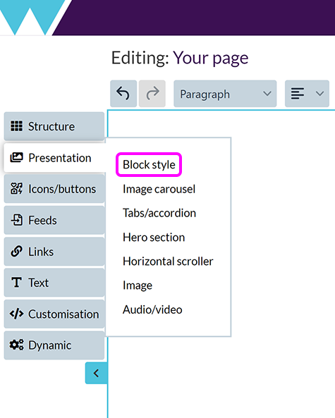
Add a block style to existing text
If you have a paragraph (or paragraphs) of text and want to add a block style, or to create a single, full-width content block:
-
Position your cursor in the text you want to add a block style to.
-
Select Add text & formatting > Block style:
-
Select the style you want from the available options in the pop-up:
Note: The colours of block styles available by default are based on the site style.
-
Selecting the Flush to edges of container checkbox removes any margins from the sides of the selected block, allowing it to fill the full available width.
-
The Flush to content above checkbox removes any margin from the top edge, so text or images within the block will appear closer to the content directly above it.
-
Deselecting Include margin below box removes the standard space below the block.
Tip: If your site or page uses custom CSS styling, you can use the Custom block class field to tell SiteBuilder to use a custom class for the selected block, like this one. To apply multiple classes, enter the class names separated by a space.
-
-
Select Submit to apply your selected style.